Styleguide
Atombody
The logodesign for a multisport food-shop. It relates to the tiniest, yet important unity of the human body, the atom. The logo depicts this bold and powerfull energy in an abstract and memorable way, by relating to the round shape of an atom, which can be seen in the letter B. I only did the logo for them, and have nothing to do with anything that was going on afterwards with the brand.
You may also like
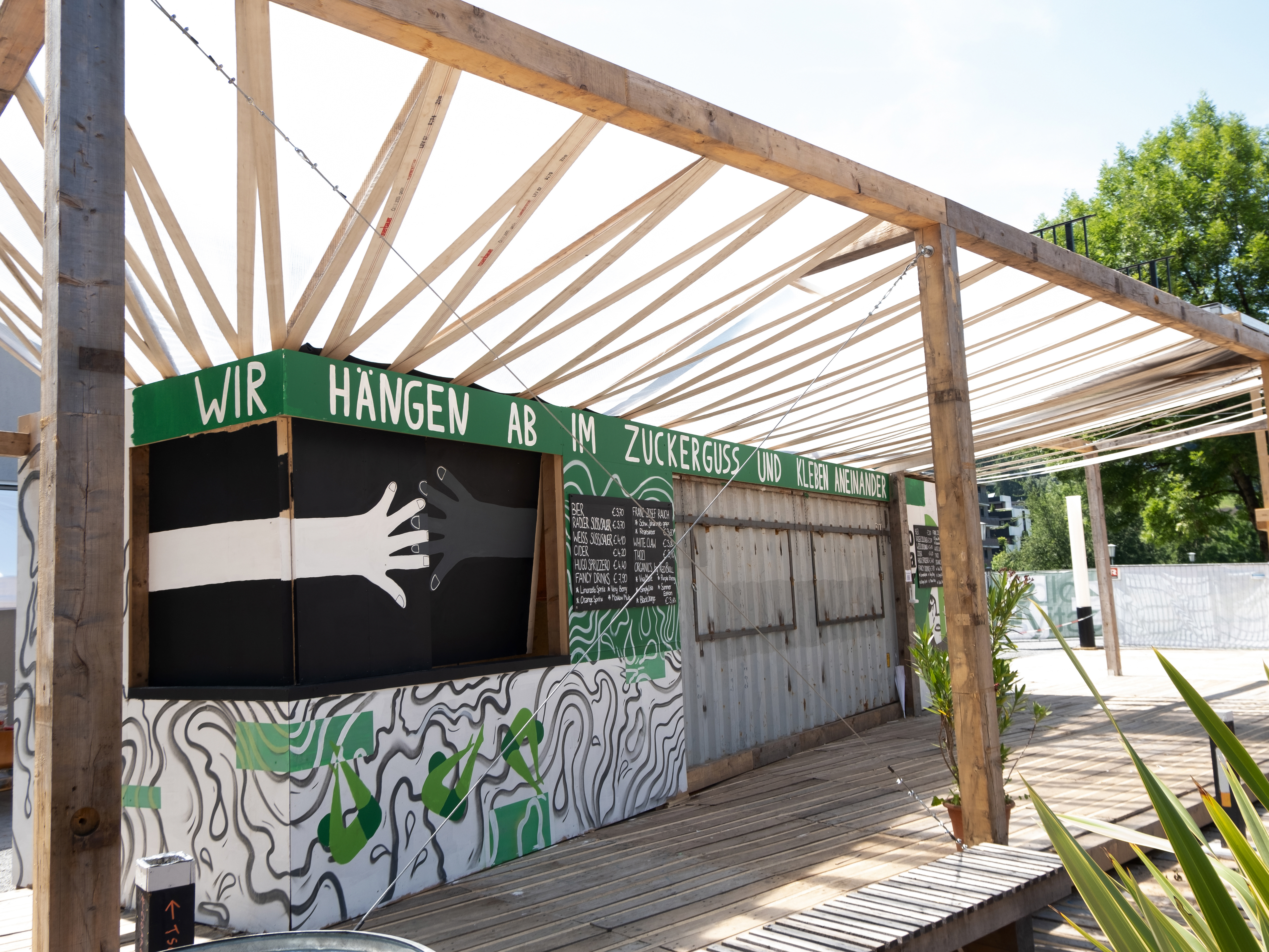
P O O L B A R F E S T I V A L
2021
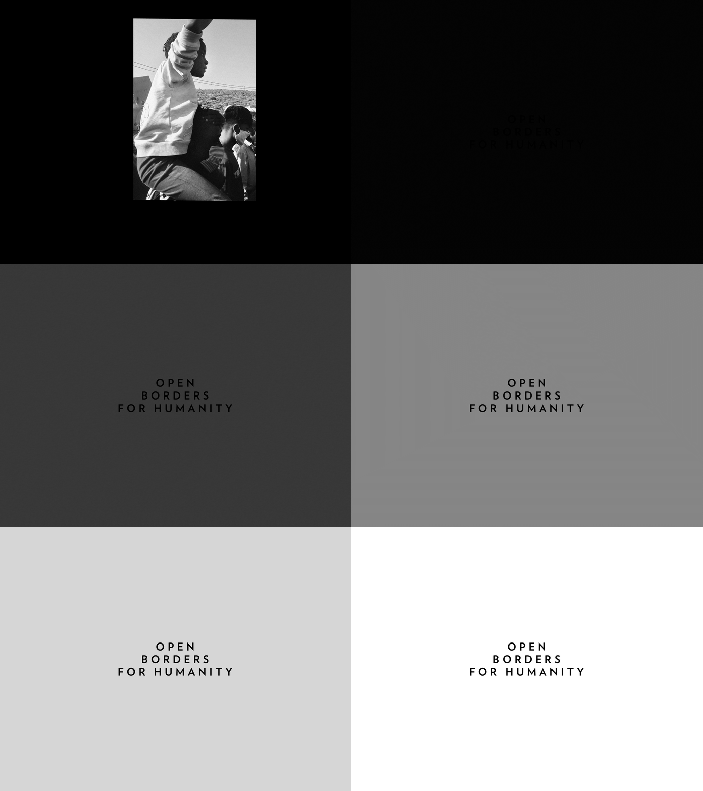
N O W Y O U S E E M E M O R I A
2021

J E S P E R J U U L T E R M S
2022
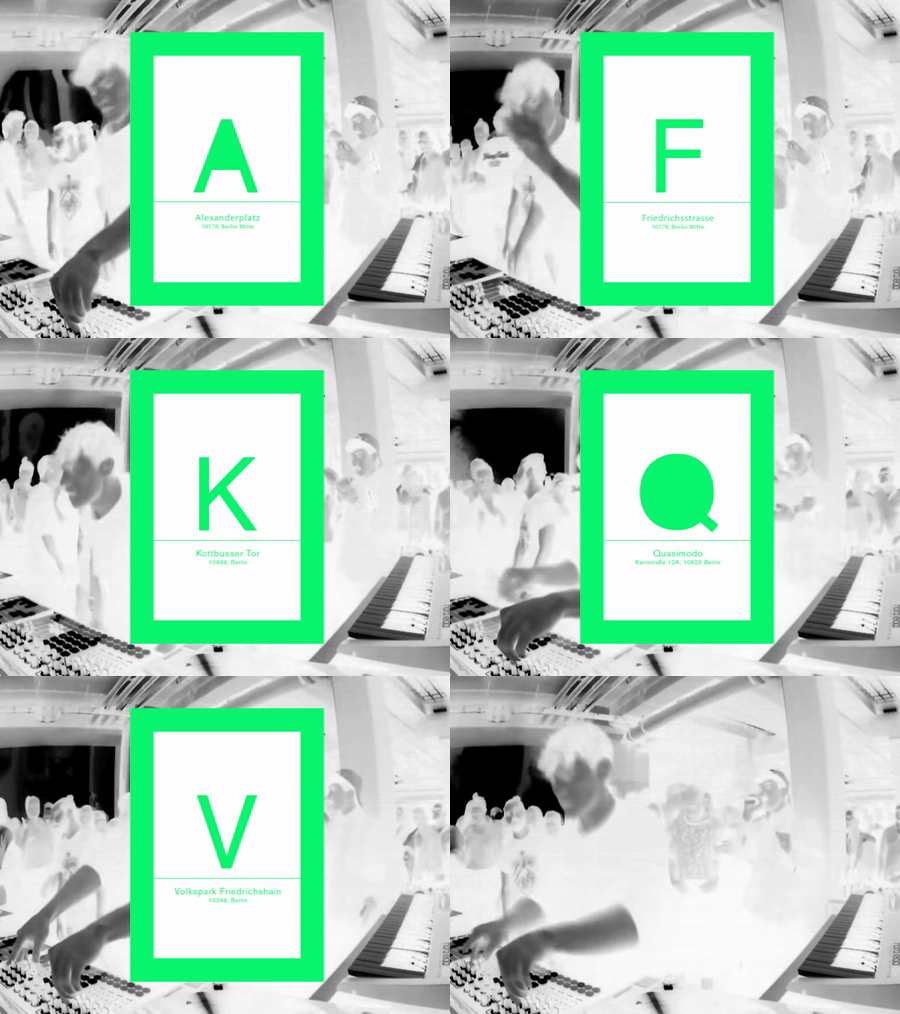
B E R L I N P O S T C A R D S
2018
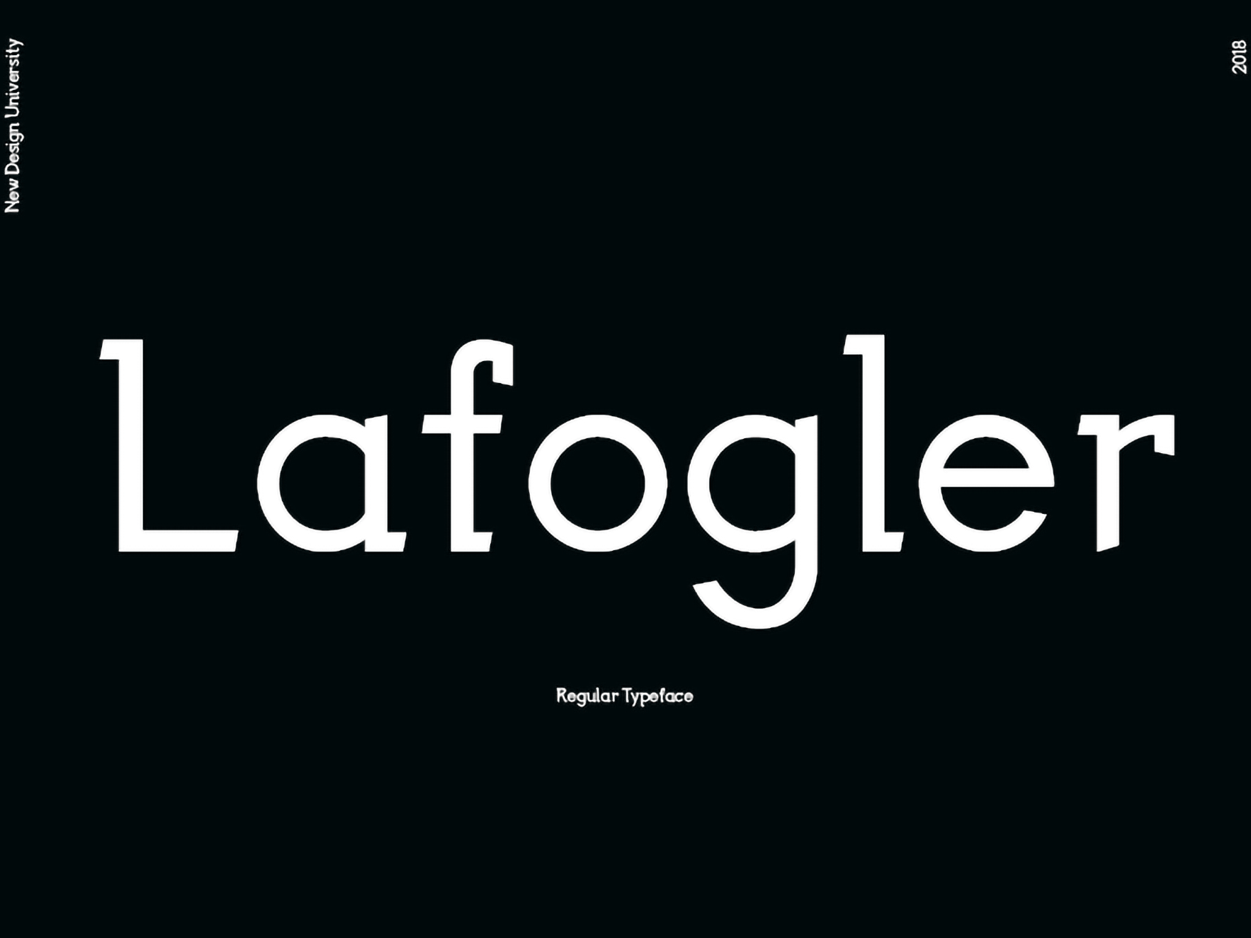
Lafogler
2019

Ö W F
2019

K U L T U R G E S C H I C H T E K A R T O F F E L
2022
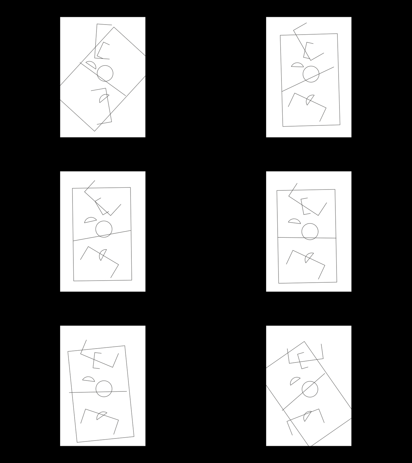
9 5 Y E A R S N O V U M
2020
B U R E A U K
2021
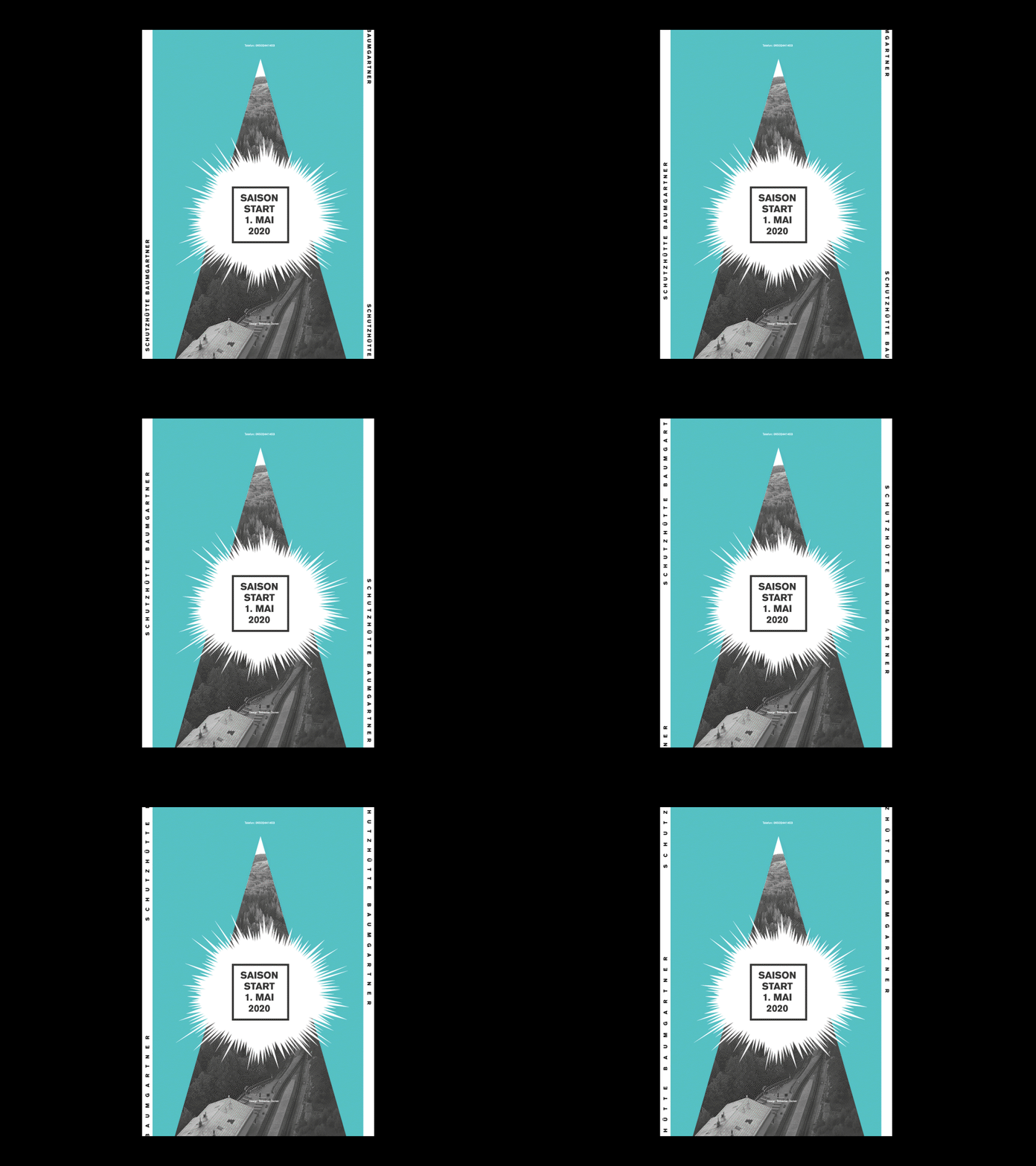
B A U M G A R T N E R H Ü T T E
2019
